
So, you want to know how to read stock charts? You've probably seen those crazy lines and colors, and thought, "What the heck is going on there?"
Maybe you're tired of just guessing, or you've heard stories of people making bank by 'reading the market.' You're not alone. Most people look at a stock chart and see a jumbled mess, but I'm here to tell you it's not as complicated as it looks. It's a skill, and like any skill, it can be learned.
I'm not going to give you some fluffy, academic explanation that puts you to sleep. We're going to cut through the noise and get straight to what matters. Think of this as our coffee chat about making sense of the market. No cringe, just real talk.
Why Even Bother with Stock Charts? The "So What?" Factor
Look, you could just buy stocks based on a hot tip from your buddy, or because a company makes a product you like. And hey, sometimes that works. But if you're serious about not just playing the game, but winning it, you need more than hope.
Stock charts are like the market's heartbeat. They show you the story of a stock's past performance, its current mood, and give you clues about where it might be headed. It's not a crystal ball, but it's the closest thing you've got to understanding the collective psychology of millions of buyers and sellers.
Imagine trying to drive a car without a dashboard. No speedometer, no fuel gauge, no warning lights. Sounds insane, right? That's what investing without looking at charts is like. You're flying blind.
See the Best Stock Trading Apps Here
The Absolute Basics: What Are You Even Looking At?
Before we dive into the fancy stuff, let's get the absolute fundamentals down. Every stock chart, no matter how complex it looks, is essentially showing you two main things over time:
•Price: This is obvious, right? How much the stock is trading for.
•Volume: This is how many shares are being bought and sold. Think of it as the intensity or conviction behind the price movement.
And then there's time. Charts are broken down into timeframes. You can look at a stock's performance over:
•Minutes: For the day traders, the quick movers.
•Hours: Still pretty fast-paced.
•Days: A common view for swing traders and short-term investors.
•Weeks/Months/Years: For the long-term investors, seeing the bigger picture.
Choosing your timeframe depends on your strategy. If you're planning to hold a stock for years, looking at minute-by-minute charts is like trying to navigate a cross-country trip by looking at every single pothole. You'll get lost in the details.
Chart Types: Your Visual Arsenal
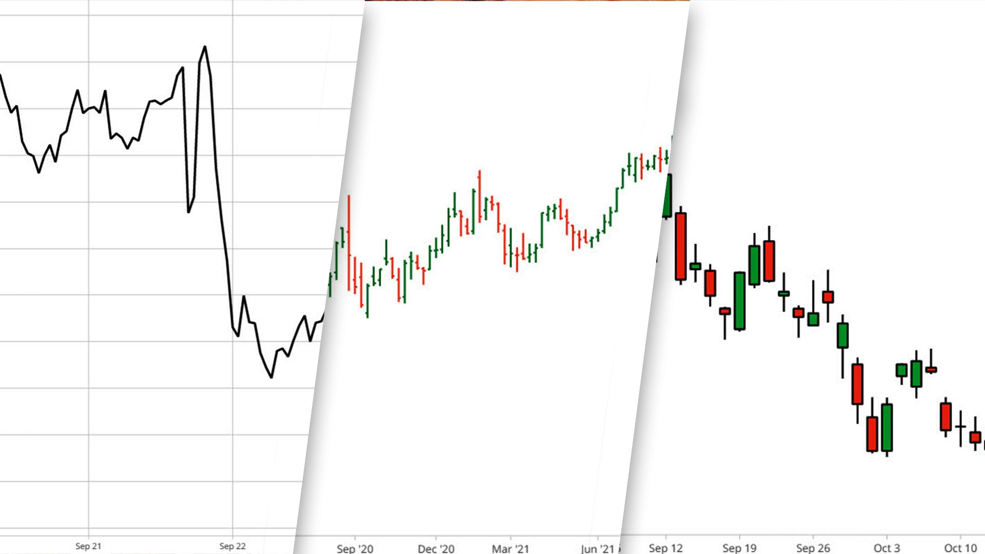
Alright, let's talk about the different ways this price and volume data gets displayed. There are three main types you'll encounter, and each gives you a little more information than the last.
1. Line Charts: The Simplest Story
This is the most basic. A line chart simply connects the closing prices of a stock over a period. It's clean, it's easy to see the overall trend, but it hides a lot of the action that happened during the day.
It's like reading the headline of a newspaper. You get the gist, but you miss all the juicy details. Good for a quick glance, not for deep analysis.
2. Bar Charts: Adding a Little More Detail
Bar charts step it up a notch. Each vertical bar represents a period (a day, an hour, etc.) and shows you four key pieces of information:
•Open: The price when the period started.
•High: The highest price reached during the period.
•Low: The lowest price reached during the period.
•Close: The price when the period ended.
The bar itself shows the range between the high and low. A small horizontal line on the left indicates the opening price, and a small horizontal line on the right indicates the closing price. This gives you a much better sense of volatility and price movement within that period.
3. Candlestick Charts: The Real Deal
Now we're talking. Candlestick charts are the go-to for most serious traders and investors. They pack all the information of a bar chart, but in a much more visual and intuitive way. Each "candlestick" tells a story about the price action during its period.
Here's the breakdown:
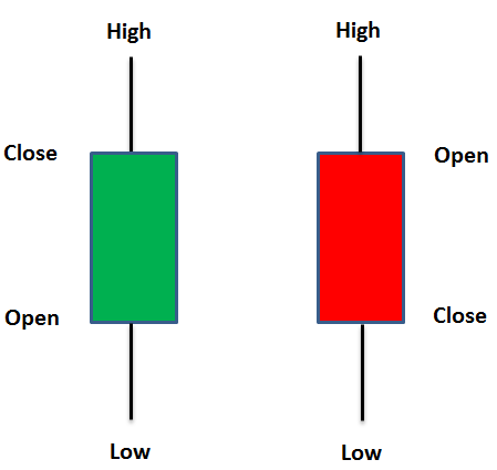
•The Body: This is the thick part of the candle. It represents the range between the open and close prices.
•If the body is green (or white/hollow), it means the closing price was higher than the opening price. Buyers were in control. This is a bullish candle.
•If the body is red (or black/filled), it means the closing price was lower than the opening price. Sellers were in control. This is a bearish candle.
•The Wicks (or Shadows): These are the thin lines extending from the top and bottom of the body. They represent the high and low prices reached during the period.
Candlesticks are powerful because their shape and color immediately tell you who won the battle between buyers and sellers during that specific timeframe. A long green body means strong buying pressure. A long red body means strong selling pressure. Short bodies with long wicks tell a different story, often indicating indecision or a reversal.
Support and Resistance: The Invisible Walls of Price
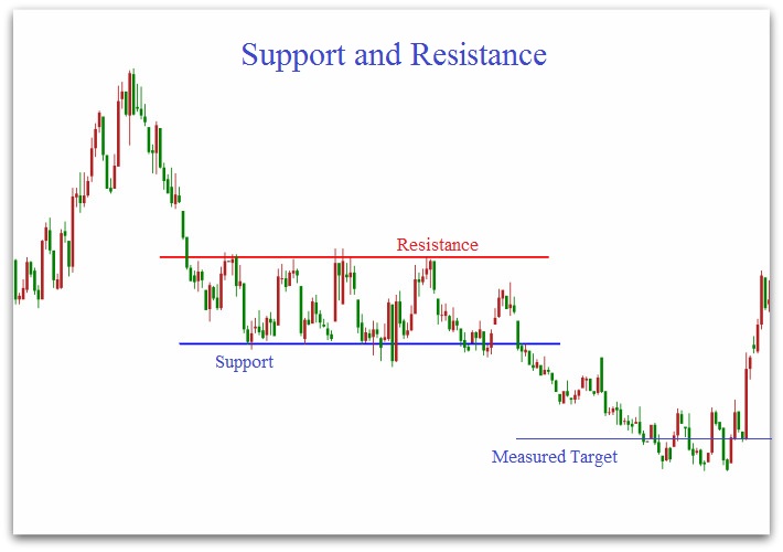
Think of support and resistance levels as invisible walls that stock prices tend to bounce off. They're not set in stone, but they're powerful psychological barriers that many traders watch.
•Support: This is a price level where a stock tends to stop falling and often bounces back up. It's like a floor. When a stock hits support, buyers tend to step in, preventing further declines. It's where demand is strong enough to overcome supply.
•Resistance: This is a price level where a stock tends to stop rising and often pulls back down. It's like a ceiling. When a stock hits resistance, sellers tend to step in, preventing further gains. It's where supply is strong enough to overcome demand.
Why do these levels exist? It's human psychology. People remember past price levels. If a stock struggled to break above $100 three times, many will expect it to struggle again. If it bounced off $80 multiple times, they'll expect it to find buyers there again.
Key takeaway: These levels aren't perfect, but they give you potential areas where a stock's direction might change. A break above resistance can signal a strong move up, and a break below support can signal a strong move down. Always watch for increased volume when these levels are tested – it confirms the conviction behind the move.
Discover the Best Monthly Dividend Stocks to Invest In
Trendlines: Drawing the Path of Least Resistance
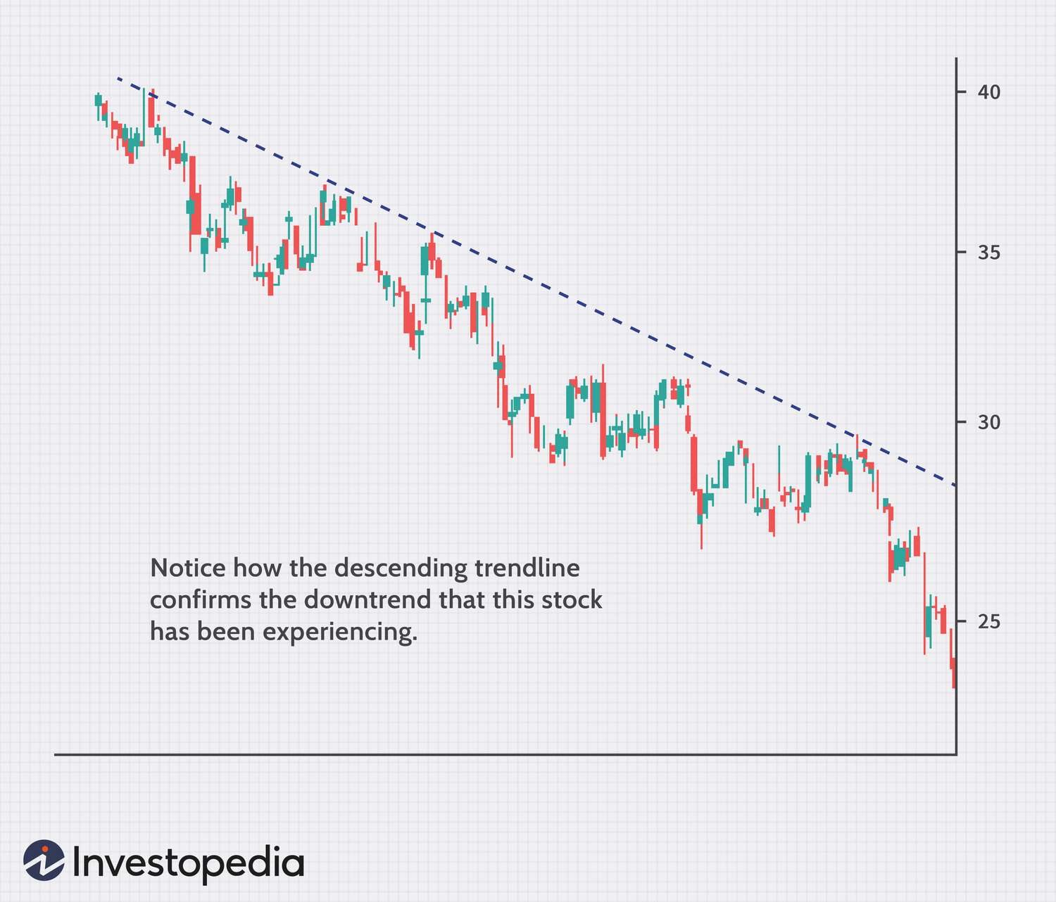
If support and resistance are horizontal walls, trendlines are the diagonal ones. They help you visualize the general direction, or "trend," a stock is moving in. Drawing them is more art than science, but they're incredibly useful.
•Uptrend: When a stock is consistently making higher highs and higher lows, you can draw an uptrend line connecting at least two (preferably three or more) of those higher lows. This line acts as dynamic support.
•Downtrend: Conversely, when a stock is consistently making lower highs and lower lows, you can draw a downtrend line connecting at least two (preferably three or more) of those lower highs. This line acts as dynamic resistance.
Trendlines help you stay on the right side of the market. You generally want to buy in uptrends and avoid or short in downtrends. A break of a trendline, especially with high volume, can signal a potential trend reversal. It's like a road sign telling you the highway is about to curve.
Volume: The Fuel Behind the Move
I mentioned volume earlier, but let's dig a little deeper. Price tells you what is happening, but volume tells you how much conviction is behind that move. It's the fuel.
•High Volume with Price Movement: If a stock breaks above resistance on high volume, that's a strong signal. It means a lot of people are buying into that move. If it breaks down below support on high volume, that's strong selling pressure.
•Low Volume with Price Movement: If a stock moves up or down on low volume, it's often a weaker move. It might not have much conviction behind it and could easily reverse. Think of it as a car sputtering along – it might be moving, but it's not going to go far.
Always look at volume in conjunction with price. It's a critical confirmation tool. A big price move without big volume is often a red flag.
Key Indicators (Without Getting Lost in the Weeds)
Now, charts can get cluttered with a million different indicators. Forget most of them. For beginners, focus on a few that give you a clear picture without overwhelming you. These are tools that help you interpret price and volume data in different ways.
1. Moving Averages (MA): Smoothing Out the Noise
Moving averages are lines on your chart that show the average price of a stock over a specific period. The most common are the 50-day and 200-day moving averages.
•What they do: They smooth out price fluctuations, making it easier to see the underlying trend. If the price is above the moving average, it's generally bullish. If it's below, it's generally bearish.
•Golden Cross/Death Cross: When a shorter-term MA (e.g., 50-day) crosses above a longer-term MA (e.g., 200-day), it's called a "golden cross" – often seen as a bullish signal. The opposite, a "death cross," is a bearish signal.
Think of it like looking at the average temperature over a month instead of every single daily fluctuation. It gives you a clearer sense of the climate.
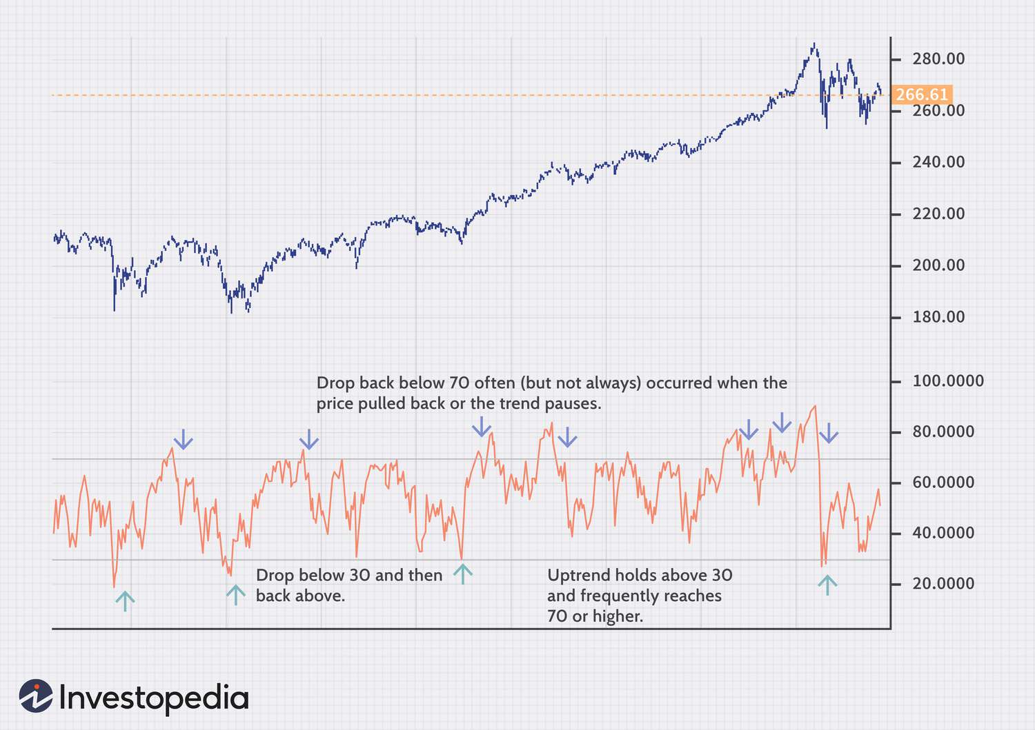
2. Relative Strength Index (RSI): Is the Stock Overbought or Oversold?
The RSI is a momentum oscillator that measures the speed and change of price movements. It ranges from 0 to 100.
•Above 70: Generally considered overbought. The stock might be due for a pullback.
•Below 30: Generally considered oversold. The stock might be due for a bounce.
Important: A stock can stay overbought in a strong uptrend or oversold in a strong downtrend for a while. Don't just blindly buy or sell because of RSI. Use it as one piece of the puzzle, especially when looking for potential reversals near support or resistance.
3. Moving Average Convergence Divergence (MACD): Trend and Momentum in One
The MACD is another momentum indicator that shows the relationship between two moving averages of a stock's price. It consists of two lines (the MACD line and the signal line) and a histogram.
•MACD Line: The difference between two exponential moving averages (usually 12-period and 26-period).
•Signal Line: A 9-period exponential moving average of the MACD line.
•Histogram: Shows the difference between the MACD line and the signal line.
How to use it:
•Crossovers: When the MACD line crosses above the signal line, it's often a bullish signal. When it crosses below, it's bearish.
•Divergence: If the price is making higher highs, but the MACD is making lower highs, that's bearish divergence – a warning sign that momentum is weakening.
It's a powerful indicator, but like all of them, it's best used in conjunction with other tools and price action.
Putting It All Together: Your First Steps to Reading Charts
Alright, you've got the basics. Now, how do you actually start using this without getting overwhelmed? Here's my advice, no BS:
1.Start Simple: Don't try to master everything at once. Pick one chart type (candlesticks), and one or two indicators (maybe moving averages and RSI). Focus on understanding those deeply before adding more.
2.Practice, Practice, Practice: Open up a charting platform (many brokers offer free ones, or use sites like TradingView). Look at charts of companies you know. Scroll back in time. See if you can identify support, resistance, and trends. Look at how the stock reacted to RSI being overbought or oversold.
3.Don't Overcomplicate It: The best traders often use the simplest strategies. Don't fall into the trap of adding a dozen indicators and trying to find a perfect system. Simplicity often wins.
4.Understand the Context: A chart is just one piece of the puzzle. Always consider the news, the company's fundamentals, and the overall market conditions. A perfect chart setup can be ruined by bad news.
5.Risk Management is King: No matter how good you get at reading charts, you'll have losing trades. It's part of the game. Focus on managing your risk so that one bad trade doesn't wipe you out. That's a whole other conversation, but it's crucial.
I remember when I first started looking at charts. It felt like trying to read a foreign language. But with consistent effort, it slowly started to make sense. It's not about being right every time; it's about stacking the odds in your favor.
So, there you have it. A no-nonsense guide on how to read stock charts to give you an edge. Now go out there, open some charts, and start learning. The market's waiting)


No comments:
Post a Comment